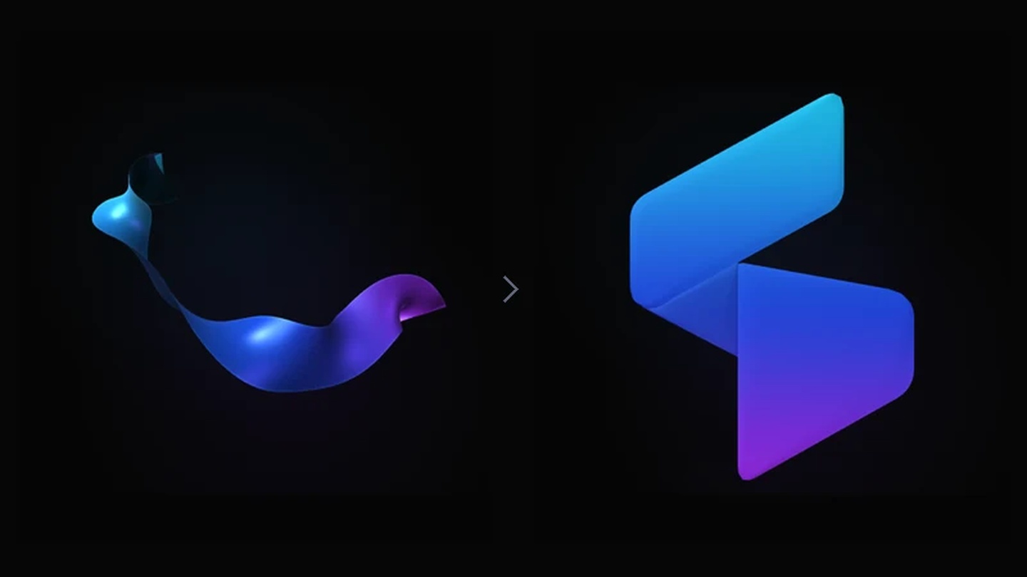
A few seconds of animation can hide a surprising number of decisions.
For the first release of our new homepage, we wanted the Craftec mark to feel like a material taking shape: a ribbon that bends, turns, catches light, and settles into our logo.
Getting there meant working on motion, composition, and rendering together. It also meant accepting that desktop and mobile did not need the same introduction.
Five directions, two production choices
We started with four approaches: a light handoff, a ribbon unfolding into the headline, a transition through the logo, and a composition we called “Content first.” A later experiment, “Spectrum Forge,” became our fifth direction.
Use the links below to explore each approach.
04 — Content first: selected for desktop
05 — Spectrum Forge: selected for mobile
We chose Content first for desktop and Spectrum Forge for mobile.
On desktop, Content first keeps the headline and call to action visible while the logo assembles alongside them. The ribbon assembly lasts 3.6 seconds, followed by a separate light sweep across the finished mark.
On mobile, we chose a different direction rather than treating the desktop composition as something to shrink. The goal remained the same: give the brand a recognizable moment without making the animation the main content.
What we built it with
The ribbon implementation combines Anime.js, a custom WebGL renderer, and GLSL shaders, with the original SVG defining the final shape.
Anime.js controls timing and animation progress. Our WebGL renderer draws the surface, while custom shaders calculate how it bends, twists, catches light, and gradually takes the shape of the logo. HTML and CSS handle the page layout and supporting effects.
The geometry starts from the three paths in our original SVG. We sample their outlines to build a mesh, then deform that mesh between a moving ribbon and the target shape. The logo is not a separate image swapped in at the end: the animated surface resolves into geometry derived from the brand artwork.
Making the ribbon feel physical
Our early iterations moved too quickly to appreciate the transformation. Extending the sequence gave us room for a broader fold, smaller traveling waves, and a more deliberate finish.
We introduced a slight delay along the ribbon: the leading end moves first, and the rest follows. A cooler reverse side makes each turn easier to read, while a narrow highlight follows the main fold.
This is deliberately shaped motion, not a cloth simulation. The aim was a convincing sense of material while preserving control over the final silhouette.
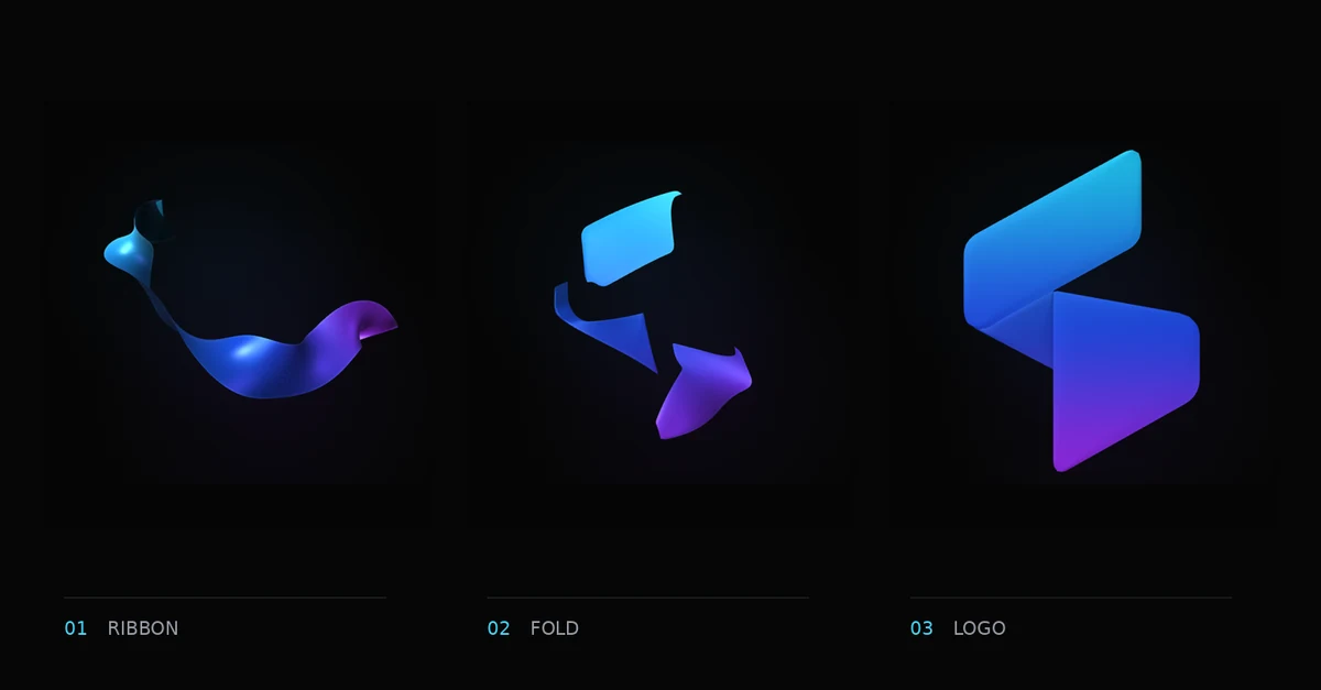
Not every effect needs WebGL. The shadow beneath the mark is a CSS effect, and the light sweep after assembly uses a separate layer masked to the SVG. These details support the material without adding everything to the 3D renderer.
When more motion became too much
Some changes looked promising until we watched them in context.
Widening the ribbon pushed it beyond the rendering area, clipping its sides. Separate easing curves for each phase introduced repeated slowdowns that made the movement feel interrupted, even without evidence of dropped frames.
We adjusted the framing and used one continuous timing curve for the assembly. The lesson was to judge the whole movement, not just individual moments that looked good in isolation.
Controlling the rendering work
The renderer avoids repeated geometry uploads when the relevant transform has not changed. It also caps the canvas’s internal pixel ratio and prepares initial frames before playback, while retaining the canvas’s displayed size.
These choices limit rendering work; they are not a promise of identical performance across browsers and devices. Watching the animation in context remains essential: a passing code check cannot tell us whether a movement feels smooth.
The ribbon implementation also retains the original SVG as a static fallback. Reduced-motion preferences skip the introduction, and unavailable WebGL does not leave the page without its logo.
Keeping the experiments
The homepage uses the selected desktop and mobile directions. The lab preserves all five explorations separately, so the alternatives remain available without bringing their preview controls into the homepage.
The result is more than a finished animation. It is a record of the decisions behind it: where motion adds character, where it gets in the way, and why the page should remain useful without it.